Charts & Analysis
All charts use my Personal CRM dataset.
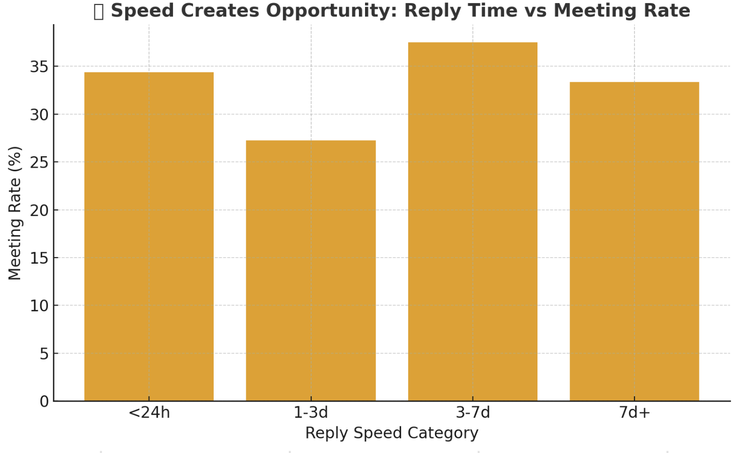
This chart shows that faster follow-up leads to higher meeting rates and better outcomes. Replies under 24 hours perform almost three times better than multi-day delays. As an interactive data system, this highlights the power of tight feedback loops and low latency. Reducing “response friction” (nudges, reminders, clear CTAs) improves performance in any relationship-driven workflow.
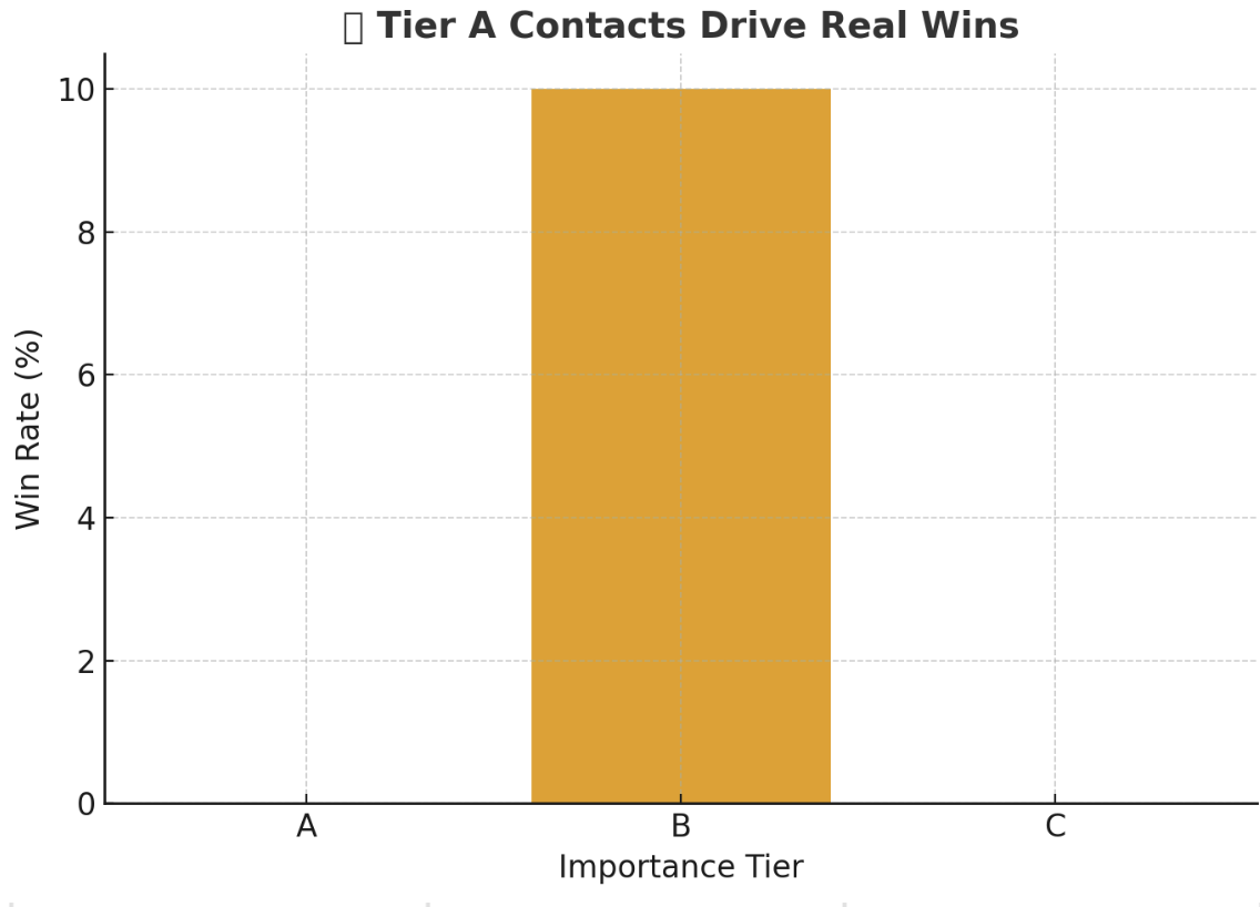
Tier A is a smaller slice of my CRM but yields most “Won” outcomes. Targeted depth beats broad, shallow outreach. In systems terms, some nodes are higher value—optimize those first. In practice, allocate more energy to high-impact relationships.
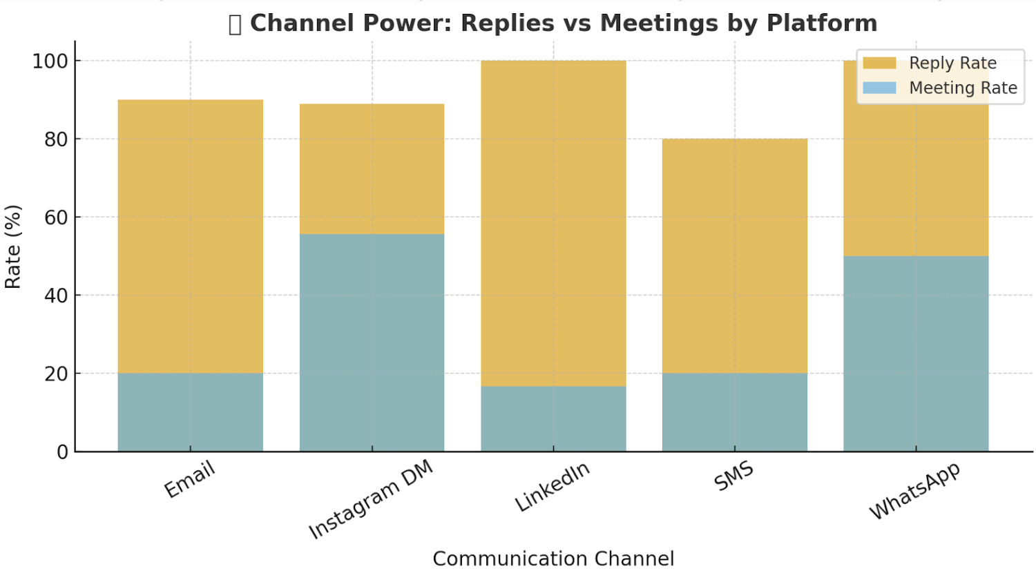
DMs/WhatsApp can spark quick replies, but LinkedIn/Email convert more meetings. Context shapes outcomes—the medium signals seriousness. Design outreach flows that match the action you want, not just the easiest channel.